Universal Design, Visual Thinking Accessibility and Intersectionality for Coaching
This will take around 6 minutes to read
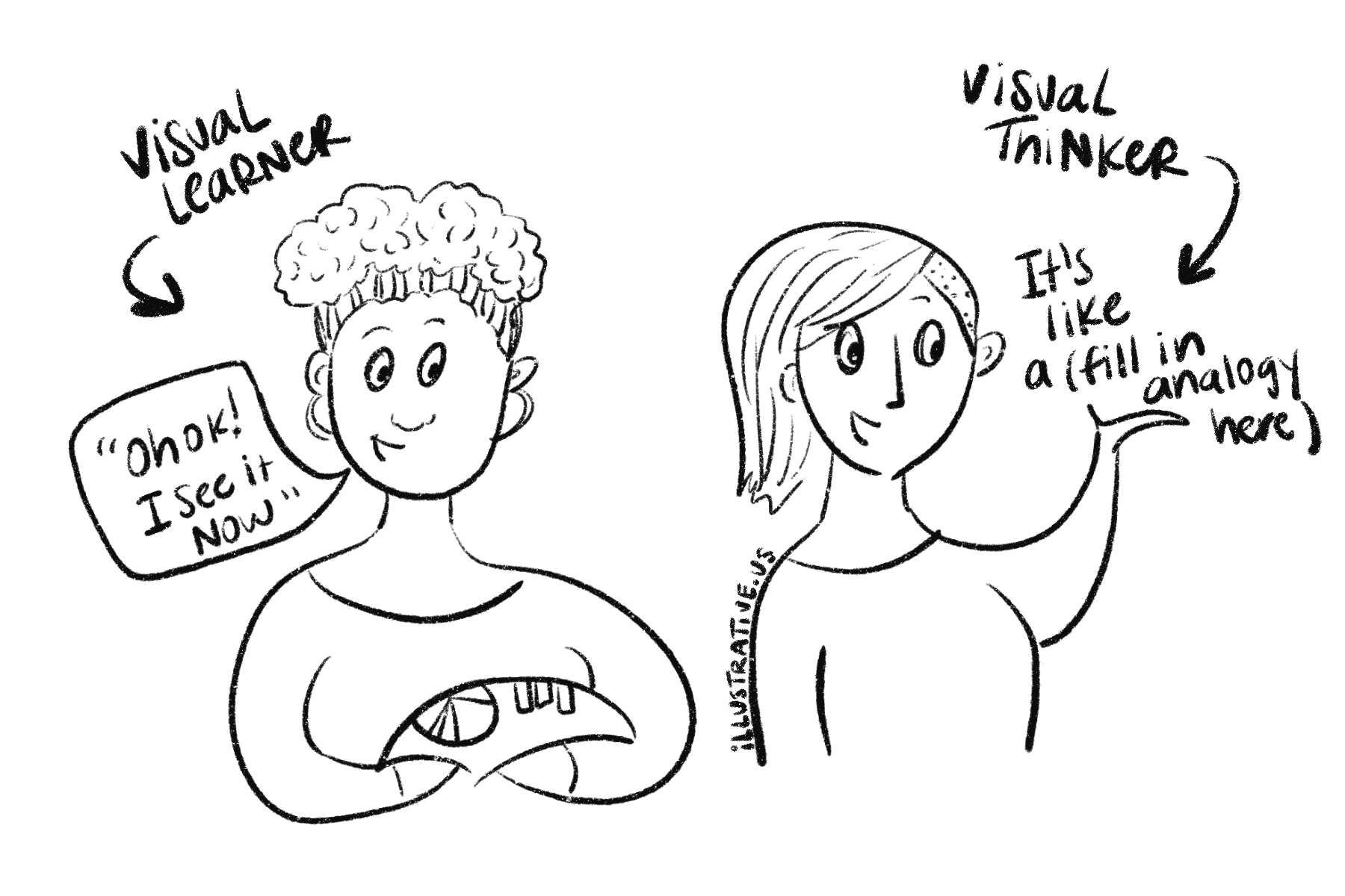
TL;DR: Visual accessibility means helping visual learners (“Oh I see it now” people) and visual thinkers (“How do I say this…” people) understand what you are saying and share their thoughts so they can fully participate in the conversation. We can only really support them if we think of it from a Universal Design (works for all students) and Intersectionality lens (thinking of new experiences caused by overlapping access issues).
Adding visual translation to your process is like adding a sign language interpreter. It’s necessary for the full understanding and participation of visual clients and in this article we will look at ways you can teach and lead more accessibly with visual thinkers, visual learners and the intersecting identities that each person has within their visual world.
Many visual thinkers have “learned the neurotypical (culturally acceptable) language” and can speak it well enough but processing in their native thinking patterns allows them to thrive. A thriving client means a client who can actively participate and give helpful feedback for an even better collaborative relationship.
But, visual translation isn’t JUST for the person who needs the accommodation. Everyone benefits from clarity, analogy and visual storytelling.
Visual Learners & Visual Thinkers/Processors
Before we get started on accessibility, let’s looks at the difference between visual learners and visual thinkers:
Visual learners need to see it to know. They are the people who say “I’ll know it when I see it” or “Okay now I see it!” 65% of people are visual learners so using visuals in your education and training is really essential to making sure your information is clear. This doesn’t just mean pictures but also role playing, showing, demonstrations, less words, clear examples, etc.
Visual thinkers use extra effort to make since of their thoughts. And visual thinkers usually need some sort of visual to learn too but may not need it completely fleshed out, just something to get them started and the rest of the visual completes in their mind.
Sometimes visual thinkers have learning disabilities like:
ADHD (moving train of thought and less dopamine)
Dyslexia (moving words)
Dyscalculia (moving numbers)
Dysgraphia (moving ideas)
Non-verbal communicators (speaks in music, movement, images and touch)
Autism Spectrum (a blend of the others and/or has trouble moving a mental picture)
Wanna learn more about this? I love this teacher’s article and the lovely names she gives each type of visual learning student on her “What I Have Learned Teaching” blog.
Accommodations come in all shapes and sizes
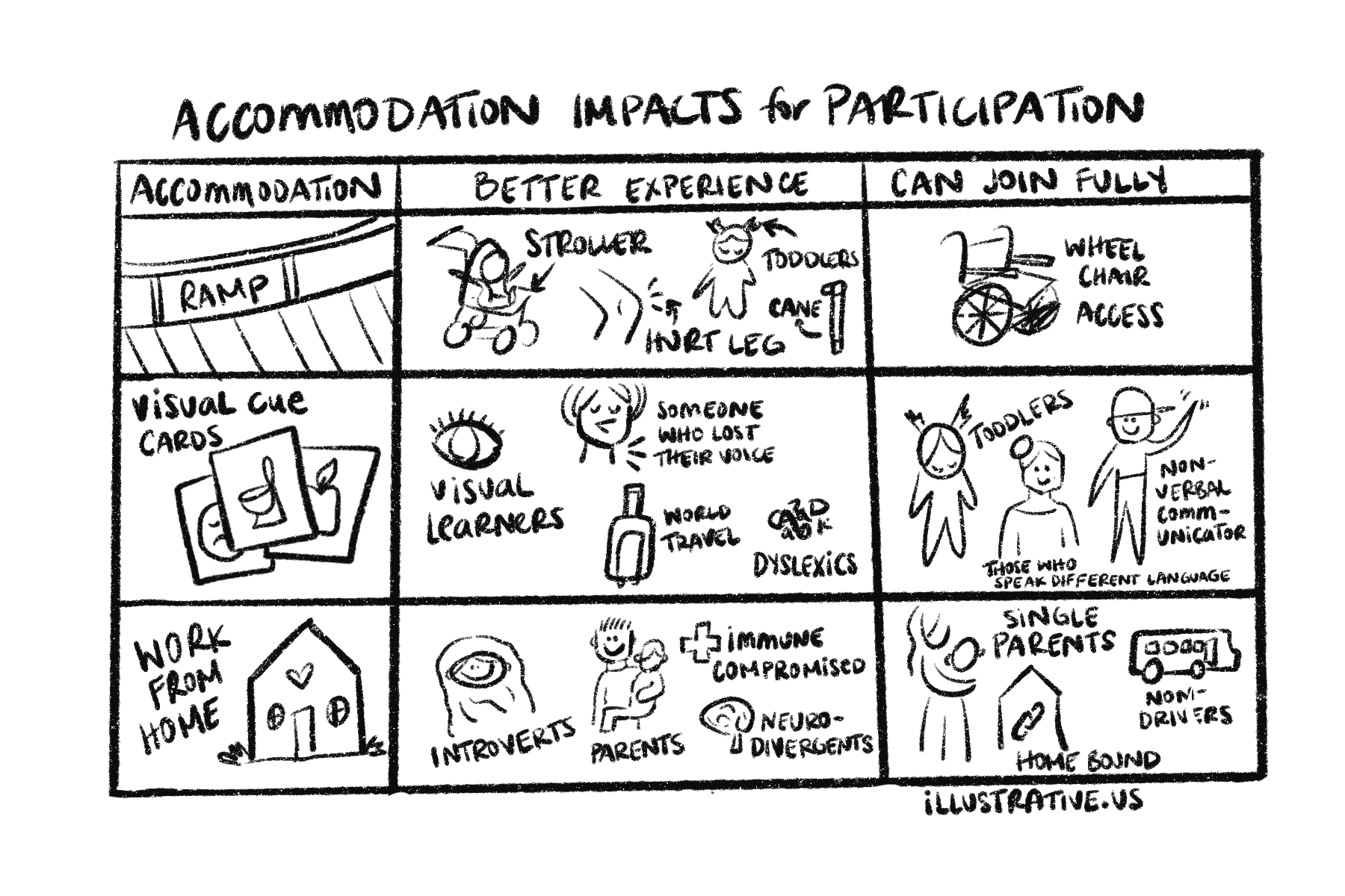
Much like there are wheelchairs and larger bathroom stalls as well as a step stool and place to set your bags… Some are specific for people to even be able to participate, others allow people to participate more fully. Here are some examples:
At Illustrative, we focus on both kinds for accessibility for visual learners and neurodivergent people to be able to access and participate more fully. The main pieces that we take into account are:
Can they use the process?
Do they understand the process?
Are they able to complete the process?
Are they being harmed in the process unintentionally?
Are they thriving? < I usually determine this by whether or not the client is excited/says they feel understood, wants to add on to the project or is now continuing it on their own and sharing about it.
Disclaimer: When most people think of Visual Accessibility they are thinking of accomodations that are made for people with blindness. That is a very important piece of the client and web experience that every business needs to attend to. I’m not an expert in that so I send people to Erin Perkins & The A11y Project
Intersectionality and universal design
Universal design is creating a curriculum that works for each possible divergence so that everyone benefits. Here’s a 5 min analogy video to walk you through it:
When we think from every angle of how our information can be shared and received we are allowing more people to participate. This includes thinking of the way your client or team member processes information as well as their cultural background, education level, access to resources and socially marginalized experiences.
Kimberley Crenshaw coined the term Intersectionality for the intersecting impacts of racism and sexism on Black women. When both of those struggles are overlapping they create a new experience that is unique from white women who experience sexism and Black men who experience racism. She said that “if reform is built around the needs of Black women then the new system would benefit more people.”
This concept is important for leaders who are supporting others in growth and building something new. Flipping our frame of what we are building from something that WE or our friends would like to something that would benefit our community INCLUDING all of their divergences will benefit a wide scope of your audience.
This doesn’t mean we only make services for one kind of most marginalized person. It means, that everyone can benefit from the accomodations that the most marginalized people need. So when you center them in your accomodations, you are still benefiting everyone.
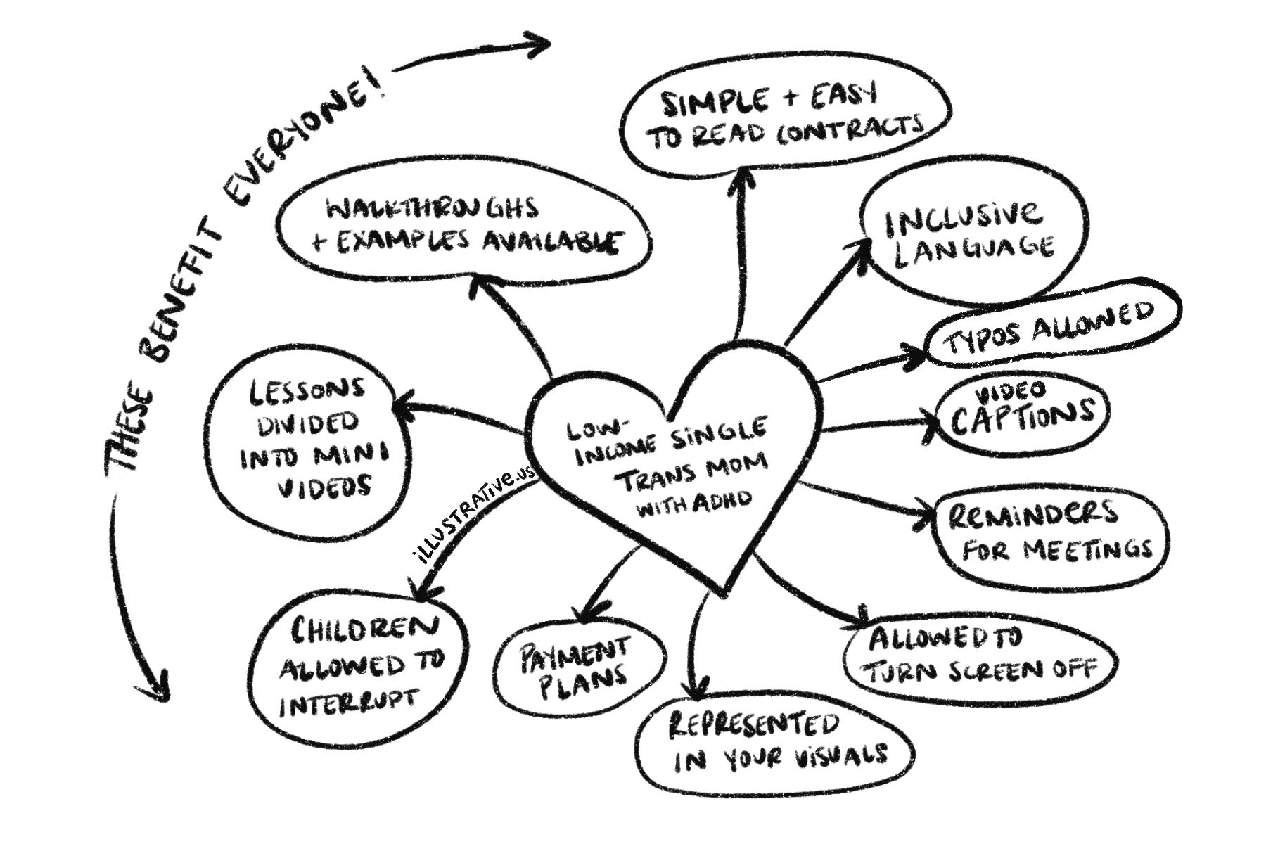
Let’s see how that works:
In the example above everyone benefits from things like seeing themselves represented, being allowed flexibility to live life and meet deadlines, to attend meetings with a sick little one present or to reschedule, to share their thoughts without having their grammar called out, to watch the lessons in small chunks when they can, etc.
Look through your process and see what would change when you center marginalized needs rather than the “general market’s” needs.
Rather than give you a list of ways to visually support your clients I will point you towards the library where you can read about it more in depth.
Visual Tools to Use:
Visual Advocacy Articles:
Have questions about this article? Leave a comment below or email me at laura@illustrative.us.
AUTHOR | LAURA MATTESON
Laura is a neurodivergent artist, mother, wife, founder of Illustrative with fancy drawing skills and a huge bucket-full of hope and love for humanity.


Learn how to use visual communication as an aid for prioritizing challenges for yourself and with your people. Types of aids that help with prioritizing are the ones that allow someone to see all of the ideas and categorize them in a gamified way. Then providing a visual aid to remember the final decision is a helpful way to allow those with active brains to remember what was discussed. When in doubt, check in with yourself or your client.